
Component properties are underrated
Component properties are underrated
How one button and one input field skipped 15+ near-duplicate variant
How one button and one input field skipped 15+ near-duplicate variant
2 min read
Concept redesign
The Underrated Fix for Design System Bloat: Component Properties
The Underrated Fix for Design System Bloat: Component Properties
The Underrated Fix for Design System Bloat: Component Properties
The Pattern I Kept Running Into
Every design system I've worked on hits the same wall eventually: too many variants. A button needs states like Default, Hover, Pressed. Add icon-or-no-icon, and that multiplies. An input field is worse: states, helper text, error messages, icons, all combining into dozens of near-duplicate components that are a nightmare to maintain.
The Pattern I Kept Running Into
Every design system I've worked on hits the same wall eventually: too many variants. A button needs states like Default, Hover, Pressed. Add icon-or-no-icon, and that multiplies. An input field is worse: states, helper text, error messages, icons, all combining into dozens of near-duplicate components that are a nightmare to maintain.
The Pattern I Kept Running Into
Every design system I've worked on hits the same wall eventually: too many variants. A button needs states like Default, Hover, Pressed. Add icon-or-no-icon, and that multiplies. An input field is worse: states, helper text, error messages, icons, all combining into dozens of near-duplicate components that are a nightmare to maintain.
Most teams solve this by just living with it. More variants, more scrolling, more places for something to go stale.
Most teams solve this by just living with it. More variants, more scrolling, more places for something to go stale.
Most teams solve this by just living with it. More variants, more scrolling, more places for something to go stale.
The Approach I've Relied On
The Approach I've Relied On
The Approach I've Relied On
Figma's Component Properties, text, boolean, and instance swap, let you decouple content and optional elements from variant state. Instead of a new variant for every combination, you build the base states once and expose controls on top. I've used this consistently across components rather than treating it as a one off; it's the difference between a component that scales and one that just accumulates variants.
Figma's Component Properties, text, boolean, and instance swap, let you decouple content and optional elements from variant state. Instead of a new variant for every combination, you build the base states once and expose controls on top. I've used this consistently across components rather than treating it as a one off; it's the difference between a component that scales and one that just accumulates variants.
Figma's Component Properties, text, boolean, and instance swap, let you decouple content and optional elements from variant state. Instead of a new variant for every combination, you build the base states once and expose controls on top. I've used this consistently across components rather than treating it as a one off; it's the difference between a component that scales and one that just accumulates variants.
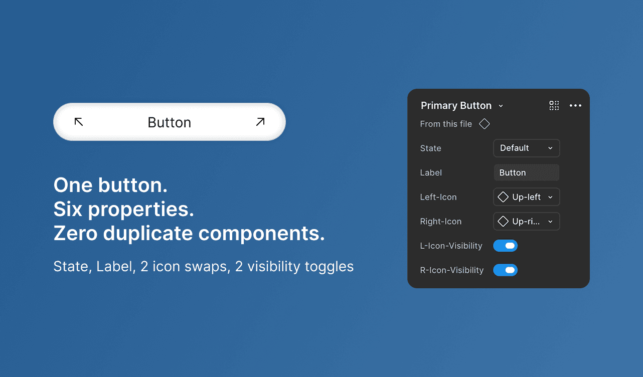
Primary Button.
One variant property (State), one text property (Label), and four more properties controlling the icons: instance swaps for which icon shows on each side, plus independent booleans for whether each icon shows at all. Six properties total, zero duplicate button components.
Primary Button.
One variant property (State), one text property (Label), and four more properties controlling the icons: instance swaps for which icon shows on each side, plus independent booleans for whether each icon shows at all. Six properties total, zero duplicate button components.
Primary Button.
One variant property (State), one text property (Label), and four more properties controlling the icons: instance swaps for which icon shows on each side, plus independent booleans for whether each icon shows at all. Six properties total, zero duplicate button components.
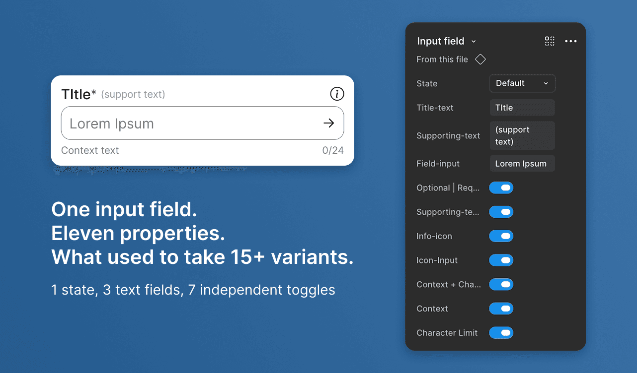
Input Field.
One variant property for state, three text properties (Title, Supporting text, Field input), and seven boolean properties controlling everything optional: the info icon, the input icon, required/optional marking, supporting text, context text, and character limit. Eleven properties on a single component, replacing what would otherwise be 15+ separate variant combinations.
Input Field.
One variant property for state, three text properties (Title, Supporting text, Field input), and seven boolean properties controlling everything optional: the info icon, the input icon, required/optional marking, supporting text, context text, and character limit. Eleven properties on a single component, replacing what would otherwise be 15+ separate variant combinations.
Input Field.
One variant property for state, three text properties (Title, Supporting text, Field input), and seven boolean properties controlling everything optional: the info icon, the input icon, required/optional marking, supporting text, context text, and character limit. Eleven properties on a single component, replacing what would otherwise be 15+ separate variant combinations.
Why This Is Underrated
Why This Is Underrated
Most designers know variants. Fewer treat properties as the actual redundancy killer they are. The distinction that matters: variants are for things that are mutually exclusive (you're never in Hover and Pressed at once). Properties are for things that can be true independently of each other (an input can have an error and an icon and helper text, all at once; that's not a new variant, that's three properties).
The Payoff
Fewer components to maintain, faster edits across the file, and instances that self-document their own usage rules instead of relying on someone remembering "oh, use the one with the icon."
Most designers know variants. Fewer treat properties as the actual redundancy killer they are. The distinction that matters: variants are for things that are mutually exclusive (you're never in Hover and Pressed at once). Properties are for things that can be true independently of each other (an input can have an error and an icon and helper text, all at once; that's not a new variant, that's three properties).
The Payoff
Fewer components to maintain, faster edits across the file, and instances that self-document their own usage rules instead of relying on someone remembering "oh, use the one with the icon."