
• CONTEXT
OVERVIEW
Discovery Built on Trust
Atmos is an AI-powered carbon offset investing platform, helping climate investors search, evaluate, and invest in verified carbon reduction projects. Every project comes with AI-summarized documentation pulled from registries and verification reports, so buyers can assess a project without digging through raw filings themselves.
ROLE
UX Designer
TIMELINE
3 weeks
FOCUS
Trust Verification
Discovery
• PERSONA
WHO IT'S FOR
The Buyer Behind the Screen
Atmos is used by ESG teams at mid-to-large companies finding carbon offset projects worth investing in. Every project has to hold up before it's worth their time, trust isn't optional, it's the job.

• PROBLEM
THE GAP
Verification Nobody Could Find
Every dollar a buyer spends on a carbon offset depends on whether the project is actually delivering what it claims. On Atmos, that answer existed, it just wasn't visible where buyers needed it. Trust ratings were tucked inside a secondary tab, and search results gave no way to tell one project's credibility from another's.

• USER JOURNEY
HOW BUYERS MOVE THROUGH IT
Two Flows, One Loop
Discovery and Evaluate & Invest aren't two isolated flows stitched together. They're a closed loop. When a project fails the evaluation criteria, the negative path routes straight back into Search/Scan rather than terminating the session, turning a rejection into a recovery point instead of a dead end. This cross-flow connection was the single biggest shift from my first pass at mapping these journeys: treating "no" as a redirect, not a failure state.
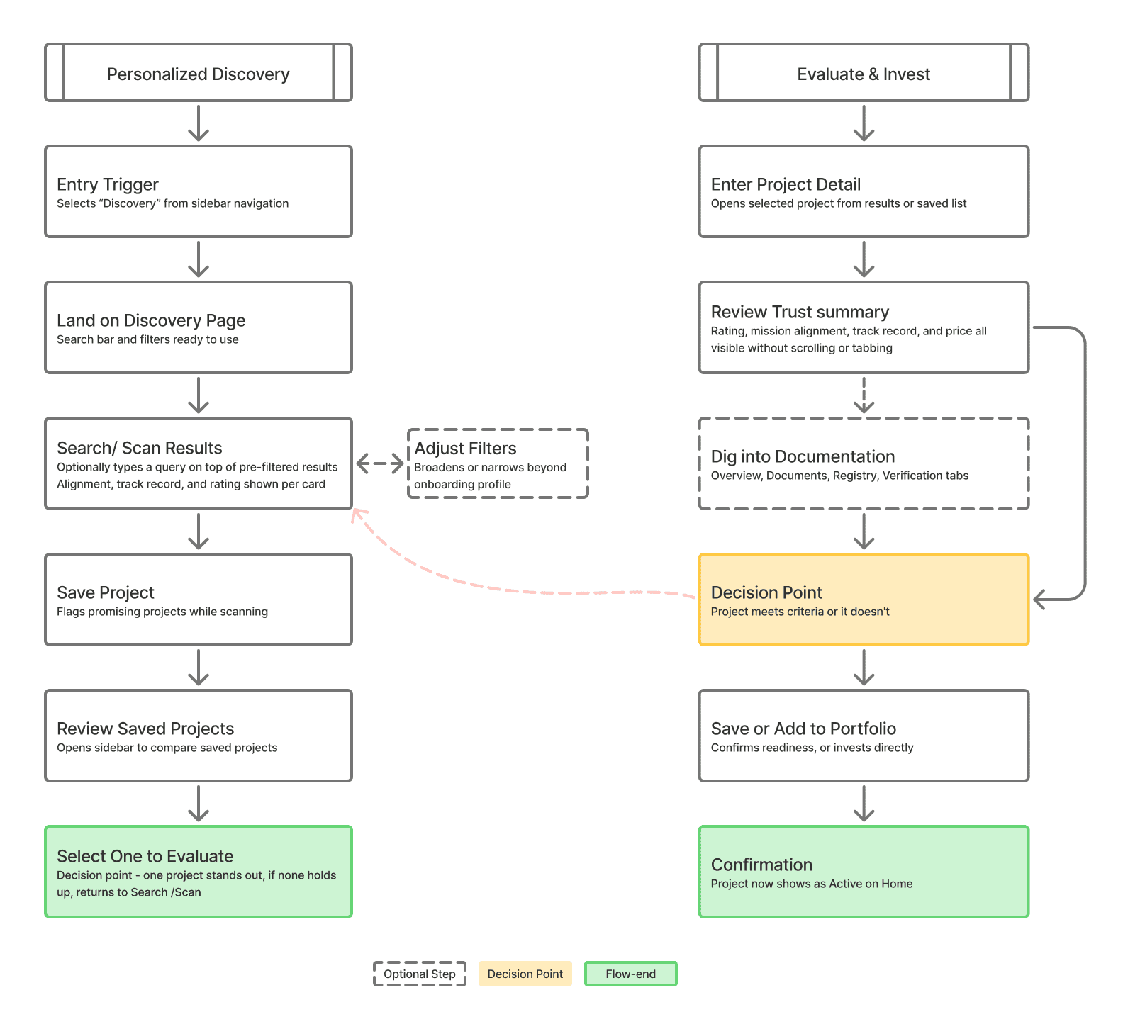
USER FLOW 1
Personalized Discovery:
The entry point. Buyers search, scan, and save, with an optional filter detour that never forces a restart. Rating, alignment, and track record are visible on every card before saving.
USER FLOW 2
Evaluate & Invest:
The commitment point. Trust data surfaces immediately, no digging required, so the decision comes down to judgment, not excavation. A "no" doesn't end the session. It feeds back into Discovery.
• Design
WHAT I DESIGNED
Trust, Surfaced at Every Layer
Home to Discovery to Project Detail, with trust signals visible at every step along the way.
HOME
One View of Where Everything Stands
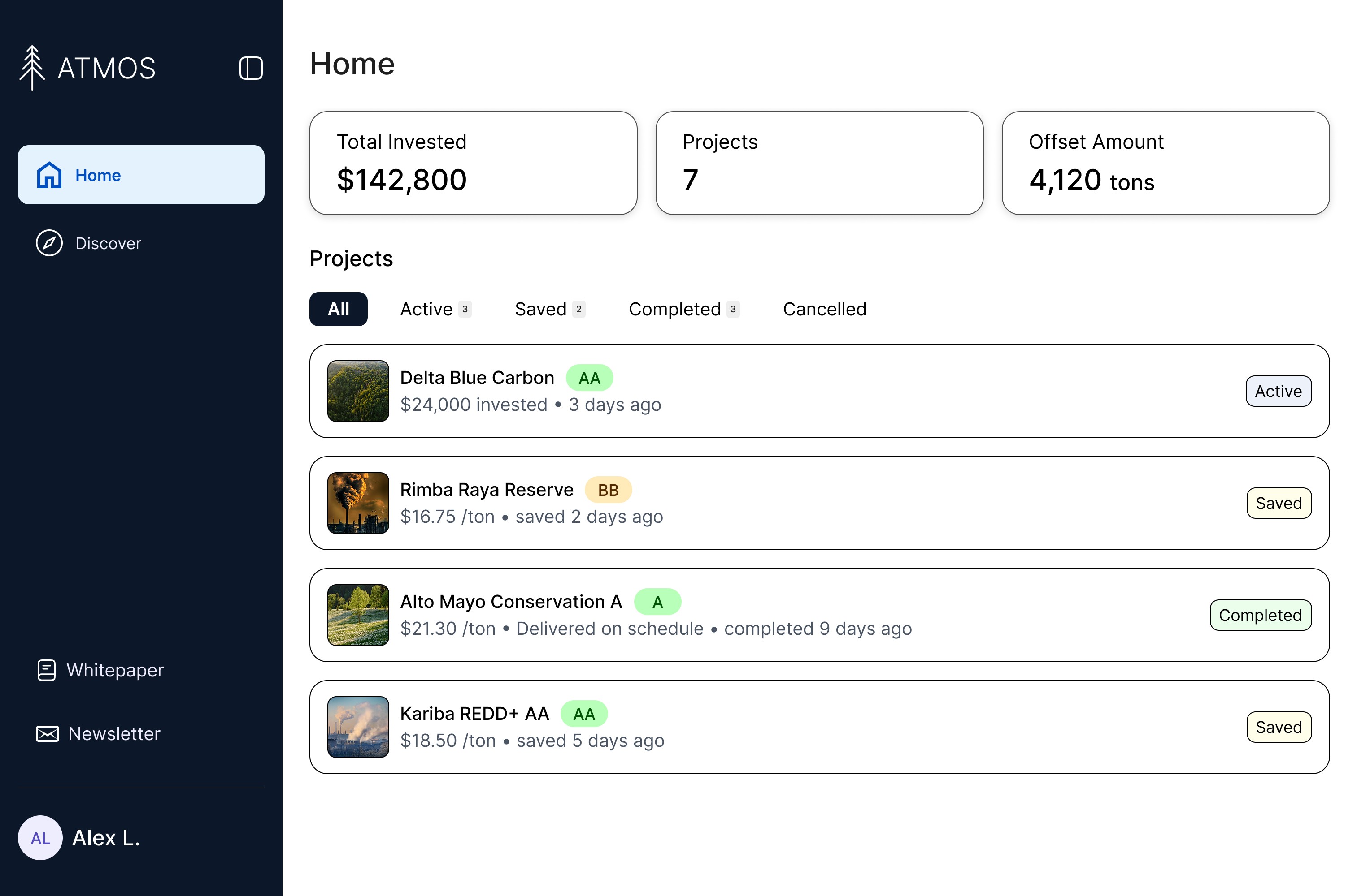
Before this redesign, a buyer's saved projects and their investment activity lived in two separate lists on the homepage, with no shared logic connecting them. A project that had been saved, one actively generating credits, and one that had already finished delivering all looked the same: just another row in a list. There was no way to tell, at a glance, what stage anything was actually in.
I redesigned this into a single unified list, with a summary strip up top so a buyer knows the shape of their portfolio before reading a single row.
Status Model

Four states, one project at a time: Active, Saved, Completed, or Cancelled. Each carries its own color and contextual detail, so status reads instantly without opening anything.
DISCOVERY
Mission Alignment, Front and Center

The original search results showed a project's image, name, and category, nothing about whether it actually matched what the buyer's company cared about. An ESG buyer scanning for climate-aligned projects had no way to tell fit from the results page itself; they'd have to open each project individually just to find out if it was even worth their time.
I added mission alignment tags directly to every card, alongside the existing rating, track record, and price. A buyer scanning results now sees fit in the same glance as everything else that matters, before a single click.
PROJECT DETAIL
Every Signal, One Glance

A trust rating tells a buyer someone else assessed the project. It doesn't tell them whether the project has actually followed through before. I added an on-time delivery percentage alongside number of projects completed, sitting right next to the rating rather than replacing it.


Rating, alignment, and track record all used to live one click deep inside a "Verification" tab. I moved all three into a summary block that loads immediately, before the buyer even starts reading Overview. Nothing new was added; what mattered most just moved up.
• REFLECTION
WHAT I LEARNED
Trust Was A Hierarchy Problem
Working on Atmos reinforced that trust isn't something you add to a product, it's something you arrange. The rating, the track record, the alignment tags: none of it was new information. It all existed before I touched anything. The redesign was entirely about where that data sat and how much effort it took to reach, not about adding anything the platform didn't already have.
It also clarified how much comparison-heavy tasks benefit from front-loading the deciding factor. When someone's job is to compare multiple options against one standard, that standard belongs in the list view, not gated behind a click.
WHAT DIDN'T MAKE THE CUT
Loop in a Colleague
Originally planned as a way to get a second opinion before committing. Cut once the flow moved from an approval-chain model to a direct-invest model, since there was no longer a natural moment for a hand-off. Worth revisiting if Atmos ever supports team-based purchasing.