• CONTEXT
• PROBLEM
• DESIGNS
DASHBOARD
Civic is an AI-powered platform for Congressional offices handling thousands of constituent communications daily. By integrating automation into communication and case management workflows, it transforms fragmented processes into structured, scalable systems.
At CIVIC, I focused on designing and evolving core workflows within a high-volume government communication environment. My work spanned new feature design, workflow optimization, and foundational system building to support long-term product growth.
ABOUT CIVIC
MY ROLE
What does CIVIC do?

Confusing Workflows

Visual Clutter

Limited Feedback
Congressional staff operate in high-pressure, high-volume environments. Even small inefficiencies compound quickly, making clarity, consistency, and feedback critical to daily performance.
CORE FRICTION AREAS
ROLE
UX Designer
TIMELINE
12 weeks
TEAM
Product Manager
UX Designer (me)
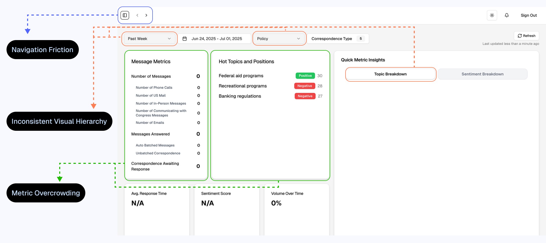
1) Navigation Friction
Sidebar required manual toggling to hide and reappear
The Solution
A hover-based expandable sidebar that remains collapsed by default but temporarily expands on hover, reducing clicks while maintaining manual control.

In fast-paced operations, small interaction delays compound quickly.
2) Inconsistent Visual Hierarchy
Buttons such as “Last Week,” “Policy,” and “Topic Breakdown” lacked consistent styling, weakening visual clarity and action hierarchy.
The Solution
Standardized button styling and color-coding to clearly differentiate primary, secondary, and contextual actions.

Visual language impacts, scan efficiency on dense dashboards.
3) Metric Overcrowding
The message metrics section compressed multiple data points into limited space, reducing readability and clarity.
The Solution
Expanded and reorganized the metrics layout to improve spacing, alignment, and overall data scanability.

High-volume dashboards require structured spacing for comprehension.
1) Action Hierarchy Ambiguity
The “Delete” action was positioned prominently in the batch list, creating potential for accidental destructive interaction.
The Solution
Repositioned and reframed actions to emphasize “Edit” as the primary interaction, reducing risk and clarifying intent.

Destructive actions should be secondary and separated from primary workflows.
2) Visual Inconsistency in Controls
The “Active Batches” button styling did not align with broader UI patterns.
The Solution
Standardized button color treatment to align with established visual hierarchy.

Inconsistent styling weakens interface predictability.
3) Inefficient Use of Layout Space
Unused whitespace on the left side constrained content width and reduced alignment consistency.
The Solution
Expanded content to span the full width, improving alignment, readability, and spatial efficiency.


Layout inefficiencies limit information density and structural balance.
4) Weak List Structure
Batch items lacked clear visual separation, making the list harder to scan.
The Solution
Introduced borders and consistent spacing to create clearer grouping and alignment.

Structured lists improve quick recognition and reduce cognitive load.

BATCHES

2) Communication Control Misalignment
Communication-type buttons were unevenly spaced, with inconsistent sizing and filter placement across multiple lines.
The Solution
Aligned all communication-type buttons on a single row, standardized padding and height, and balanced label length for consistent visual structure.
Misaligned controls weaken visual rhythm and reduce clarity.
1) Inefficient Use of Space
Excess blank space before input fields disrupted visual flow and reduced layout balance.
The Solution
Removed unnecessary negative space and tightened vertical alignment to create a smoother, more structured input flow.

Unstructured spacing slows scanning and interrupts form progression.
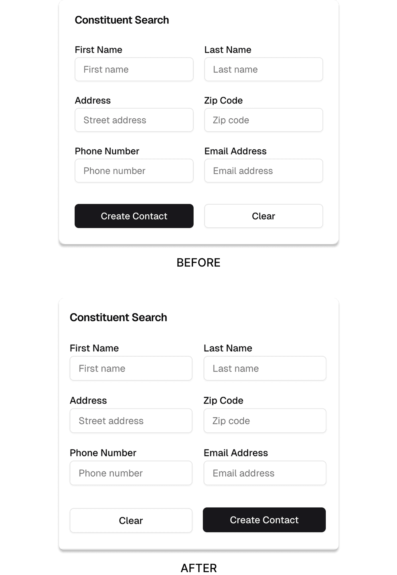
3) Primary vs Secondary Action Hierarchy
“Create Contact” and “Clear” lacked clear positional hierarchy, reducing action predictability.
The Solution
Repositioned “Create Contact” as the right-aligned primary action and visually de-emphasized “Clear” to reflect proper hierarchy.
Primary actions should follow established interaction conventions.

MANUAL ENTRY

1. Hidden Primary Actions
Key controls such as search, create contact, and advanced search were fragmented across the interface, with some options hidden inside a kebab menu.
The Solution
Reorganized the layout by aligning search, create contact, and advanced search on a single row, removing the kebab menu and surfacing all primary actions directly in the interface.
Frequently used action buttons visiblility reduces interaction friction.
CONTACTS

2) Unstructured Contact List
Contacts were displayed in a list without a clear table structure, resulting in inconsistent alignment and slower scanning.
The Solution
Converted the list into a structured table layout with improved alignment and introduced an edit button for quick access to individual contact updates.
Structured tables improve readability and allow users to quickly locate information.
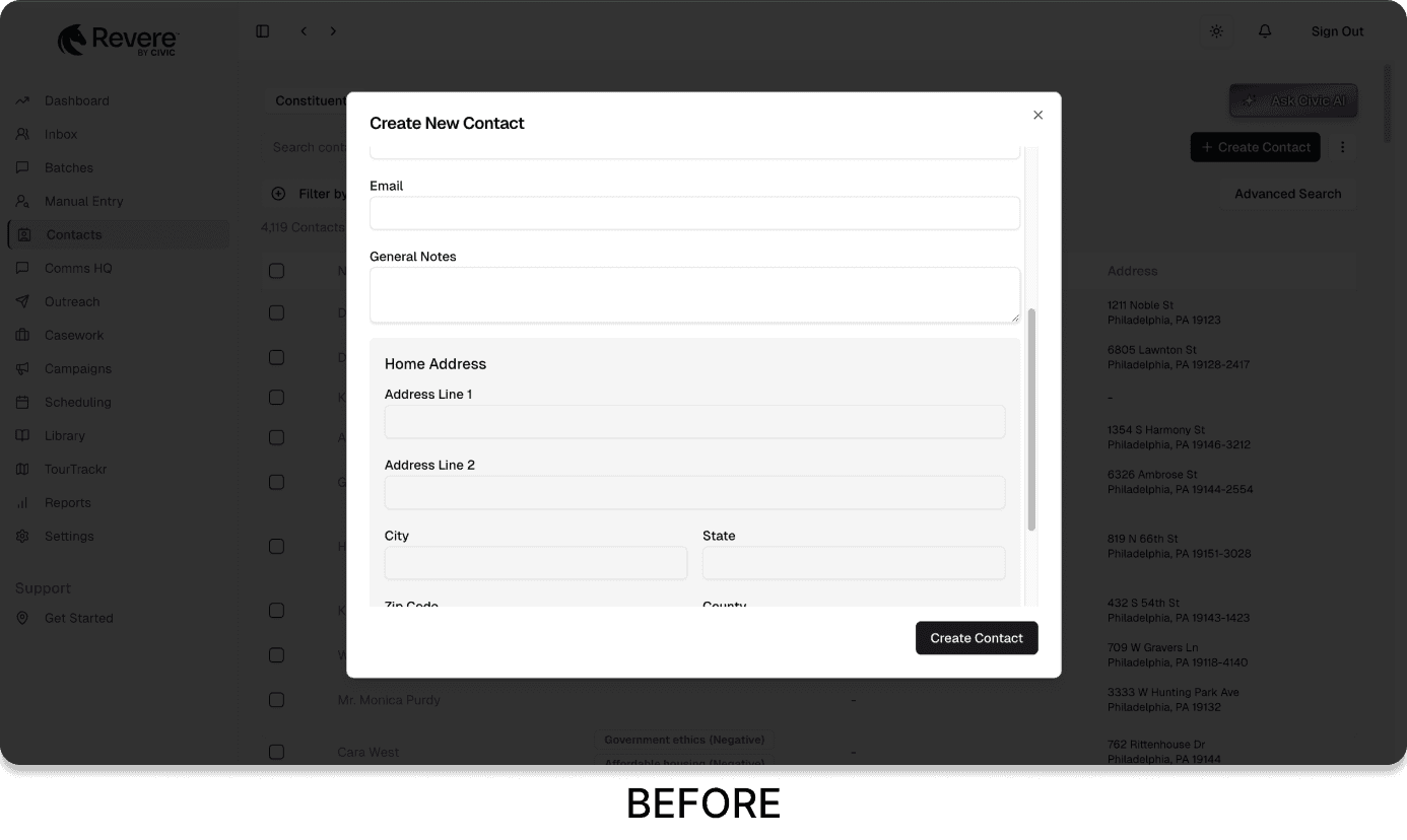
3. Scroll-Heavy Contact Creation
The contact creation popup required scrolling, increasing cognitive load and interrupting the input flow.
The Solution
Redesigned the popup into a compact, non-scrollable layout by resizing and realigning input fields to fit within a single view. A "Cancel" action was also introduced, allowing users to easily exit the flow if they decide not to create a contact.

Inconsistent styling weakens interface predictability.
4. Inefficient Advanced Search
The advanced search section expanded into a large input panel that disrupted layout balance and lacked clear interaction controls.
The Solution
Reduced the panel height, realigned input fields, added a dedicated search button next to clear, and introduced individual “x” controls to quickly reset specific inputs.


Search filters should remain compact and easy to interact with.


SETTTINGS
Settings page contains multiple subsections, so strong hierarchy and clear navigation cues are essential for quick orientation.
The Problem
The settings page lacked clear visual hierarchy and efficient use of space. The top horizontal area was underutilized, active subsections were not clearly highlighted, and the absence of visual indicators made navigation harder to scan.
The Solution
Reorganized the layout to better utilize the top space, added a boxed highlight for the active subsection to improve visibility, and introduced icons with bold typography for each settings category to strengthen visual hierarchy and scanability.
• LEARNINGS
Working on Civic reinforced the importance of designing for high-volume operational environments. When users perform the same tasks repeatedly throughout the day, even small inefficiencies in navigation, filtering, or layout can significantly slow down workflows. This experience highlighted how thoughtful structure, clear hierarchy, and streamlined interactions can meaningfully improve speed and clarity in daily operations.
Another key takeaway was the value of designing with systems in mind rather than isolated screens. Establishing consistent patterns across dashboards, lists, forms, and settings helped create a more cohesive experience while also enabling faster iteration. Contributing to foundational design patterns also showed how scalable components support product growth without sacrificing usability or consistency.
