• CONTEXT
• PROBLEM
PROJECT GOAL
A single app that brings fresh food ordering and food tracking together
MealUp takes the guesswork out of home cooking. With a smart ingredient library and step-by-step video guides, anyone can cook healthy, great-tasting meals — fast.
ROLE
End-to-End UX Designer
DURATION
2-week design
TOOLS
Figma, Wireframing, Prototyping
USER NEEDS

Simple

Healthy

Ability to Track
As I spoke with users about weeknight meals, a pattern emerged: cooking at home often feels less like a choice and more like a daily struggle.
P1 Busy Professional
“After work, I’m exhausted. I want to cook something healthy, but I just stand in the kitchen feeling stuck, wondering what do I even make?”
P2 Practical Planner
“After a long day, I don’t have the energy to experiment or figure things out on my own. I just want clear, simple steps I can follow so I can cook quickly without feeling stressed or second-guessing myself.”
GOAL

How might we
• DESIGN
• RESEARCH
• PROCESS
OVERVIEW
For many people, cooking at home starts with hesitation: choosing the right meal, thinking about portions, hoping the recipe will work. It often feels uncertain before it even begins.
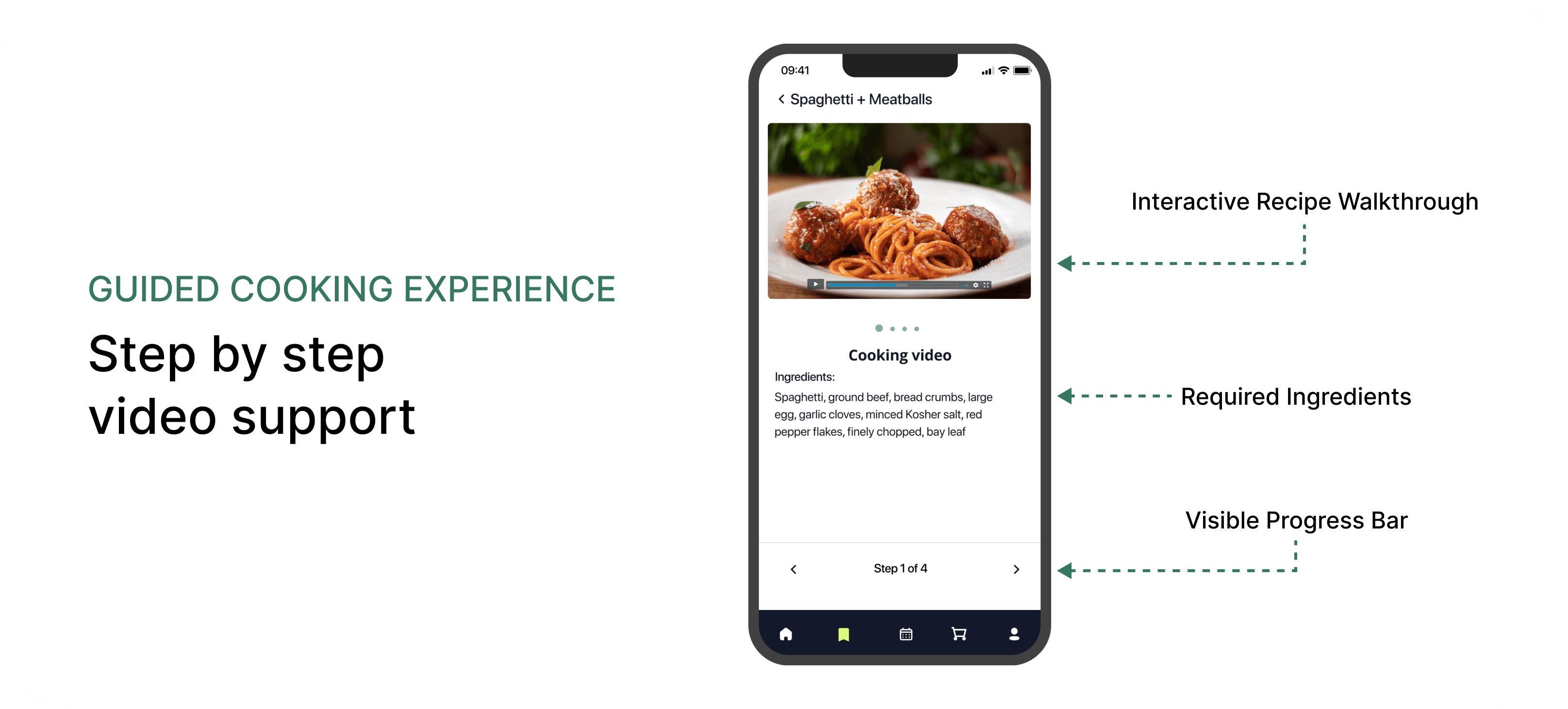
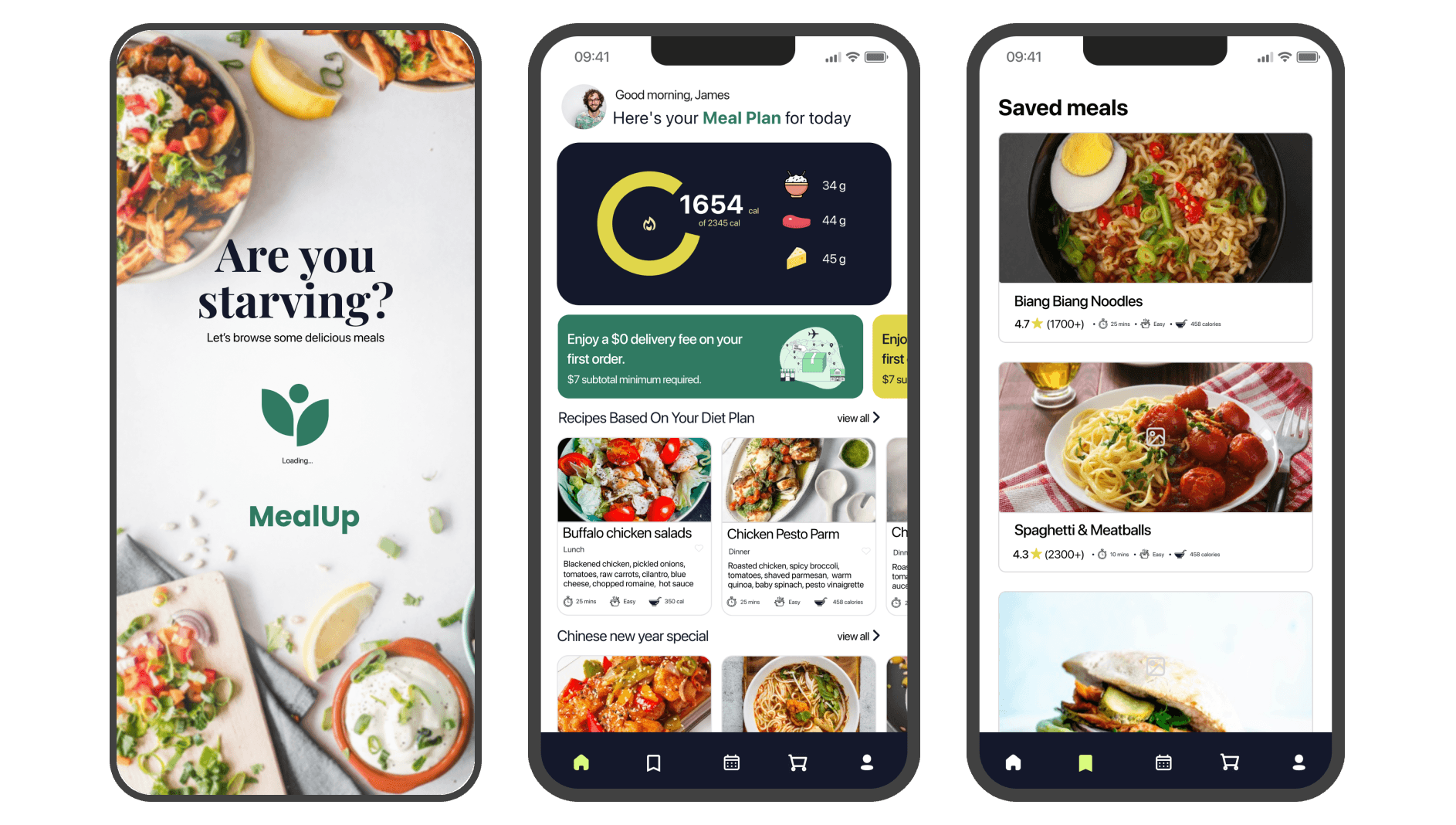
MealUp gently guides users through that experience. They select their portion size, receive fresh, pre-measured ingredients, and scan a QR code to follow a step-by-step video recipe. By linking ordering, guided cooking, and nutrition tracking, MealUp replaces uncertainty with structure — helping users feel supported and confident in their kitchen.
From Ordering to Cooking — Without the Guesswork

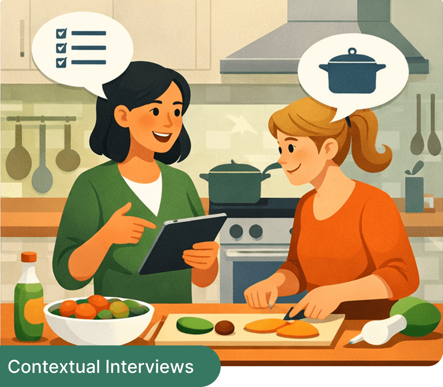
Observing decision making in real environments

Quick insights from spontaneous user conversations
RESEARCH METHODOLOGY
Understanding real cooking behavior
Competitive Analysis

RESEARCH INSIGHTS

What I found
VISUAL DIRECTION
Defined aesthetic foundation
Mood board

This exploration focused on vibrant ingredients, structured meal systems, and visual clarity to reinforce trust and health awareness.
EARLY CONCEPT PROTOTYPE


USABILITY TESTING
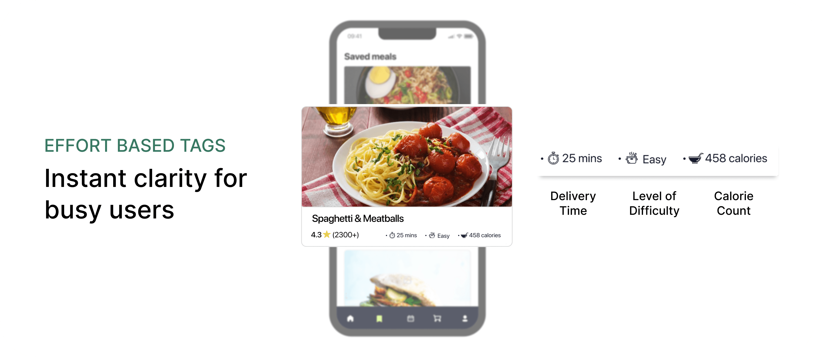
After conducting usability sessions and synthesizing the findings, several clarity issues surfaced. Users struggled with unfamiliar icons, showed low engagement when cooking videos appeared at the end of the flow, and found certain navigation labels unclear on desktop.
These insights led to introducing more recognizable icons, repositioning the cooking video to the beginning of the experience, and renaming “Saved Recipes” to “Saved Meals” for better comprehension.
• FINAL DESIGNS
• LEARNINGS


HI FI DESIGNS
TYPOGRAPHY & ASSESTS

This project reinforced that simplicity is intentional, not accidental. Clear structure, familiar visual language, and guided flows significantly reduce user hesitation. I learned that designing for confidence requires anticipating uncertainty at every step of the journey, and that early usability testing is essential to uncover friction that may not be visible in design alone.
