• CONTEXT
• PROBLEM
• USER RESEARCH
• VISUAL LANGUAGE
• DESIGN PRINCIPLES
• DESIGN PROCESS
• OUTCOMES
• REFLECTION
• KEY SCREENS
OVERVIEW
A gentle companion for the parenting journey
Existing tools fail the people who need them most
Nurture is a mobile-first baby tracking app built for new parents navigating the chaos of newborn care. The design brief was deceptively simple: make logging feel effortless. In practice that meant rethinking every interaction pattern, from onboarding to the moment a parent needs to know if their baby last fed 40 minutes or 2 hours ago.
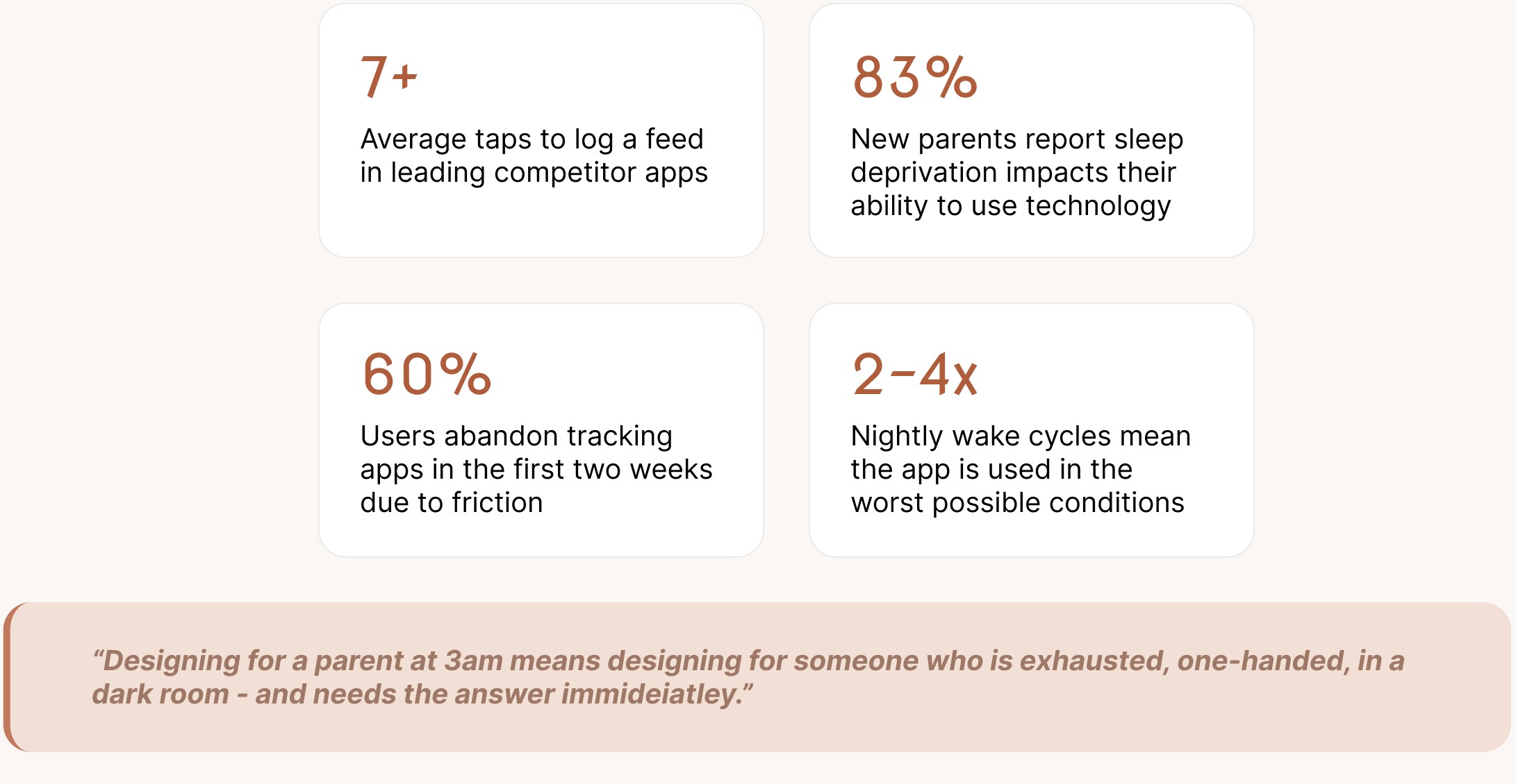
Baby tracking apps are typically built by engineers, not parents. The result is interfaces that demand full attention, fine motor precision, and clear-headed decision-making — exactly what new parents don't have.

Two caregivers, one shared goal
A palette designed to feel like comfort
Six rules that governed every decision
From research to 12 production screens
What the design delivers
WHAT THIS PROJECT TAUGHT ME
The visual direction was guided by the emotional context of use — warmth, calm, and reassurance. Terracotta grounds the primary actions with warmth rather than urgency. Lavender softens AI and smart features. Sage carries positive data and growth. The overall effect feels like a well-designed nursery, not a medical dashboard.
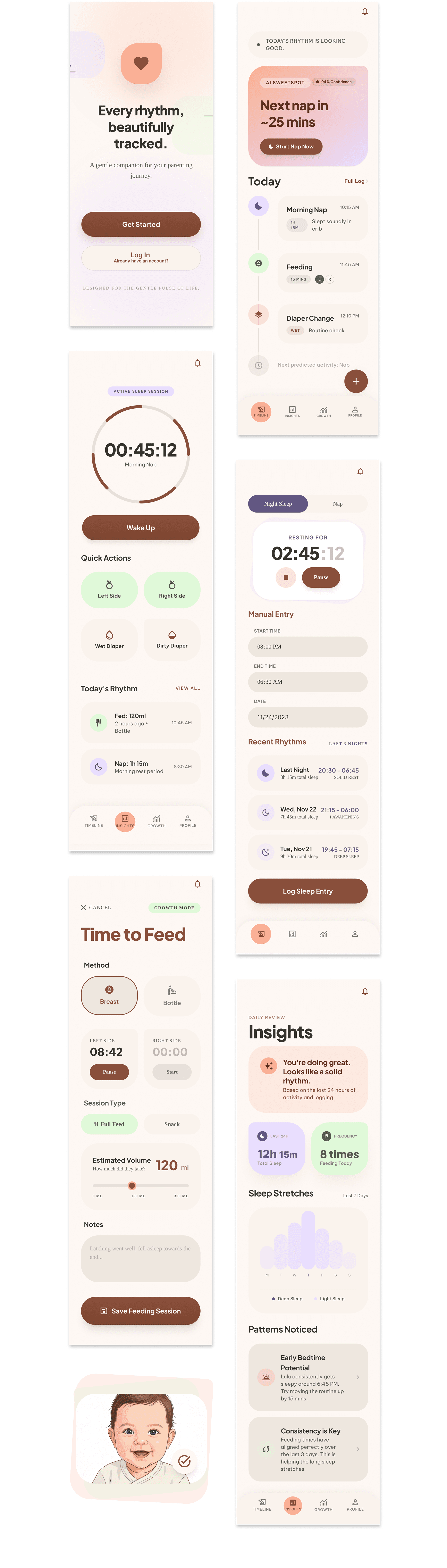
From the home dashboard to AI-powered SweetSpot predictions, each screen was designed to answer one specific question as fast as possible.
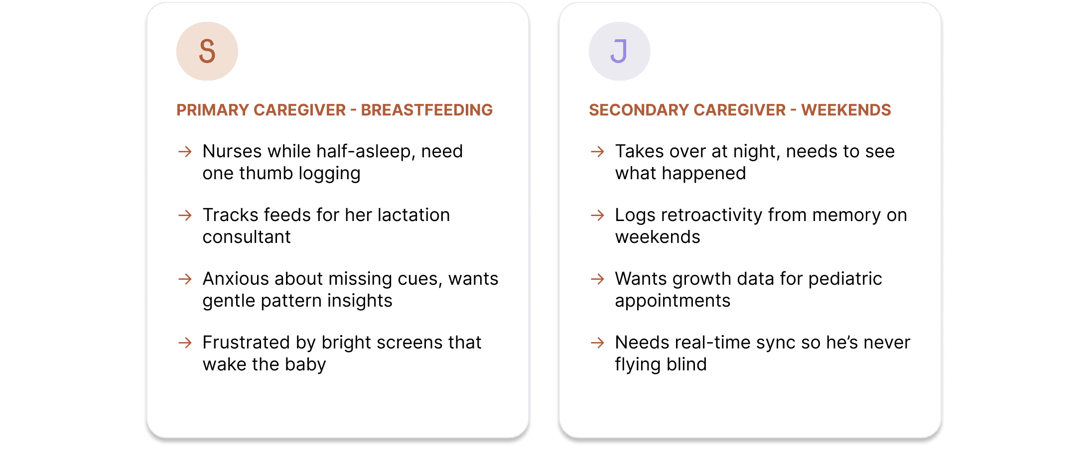
Research synthesis surfaced two distinct but equally important personas — the primary caregiver who lives inside the app, and the secondary caregiver who needs to stay sync without friction.


Competitive audit + context mapping
Audited 8 existing baby tracking apps, mapping every tap required to complete core tasks. Identified that all competitors prioritized feature depth over speed of use — a clear opening.
Information architecture + task flow
Reduced primary navigation to 4 sections. Designed the home dashboard to auto-surface the 3 most-asked questions — last feed, last diaper, sleep status — without requiring any navigation at all.
Low-fidelity prototyping + tap-count testing
Built paper prototypes and counted taps for each core task. Iterated until every action reached the 3-tap target. The quick-log bottom sheet ("What would you like to record?") emerged from this phase.
Visual language + SweetSpot AI feature
Developed the warm terracotta / lavender / sage palette. Lavender was chosen specifically for AI features to signal "smart assistance" without the cold, clinical associations of blue. The SweetSpot feature needed to feel like a helpful suggestion, not a medical directive.
Component system + handoff
Built a full component library covering all states — empty, loading, active, error — across all 12 screens. Defined the data model to support offline-first logging with real-time sync when connection restores.
1
2
3
4
5
Context is the constraint.
Designing for "exhausted, one-handed, 3am" forced every single decision to justify itself. It's one of the most clarifying constraints I've worked with — and one I'll apply to any high-stakes use case.
AI features need emotional design, not just technical design.
SweetSpot only works if parents trust it. The lavender color, the soft copy ("find the perfect rhythm"), and the opt-in framing were as important as the prediction algorithm itself.
Data can be calming.
Most health apps present data as something to be anxious about. Nurture's Insights screen proves the opposite — weekly averages, positive framing, and celebratory language transforms the same data into reassurance.
1
2
3
